
Disney+ Plan Comparison Chart
Categories:
Visual Design, Art Direction, Web Design, UI/UX, Information Architecture, Content Strategy

Compare & Contrast
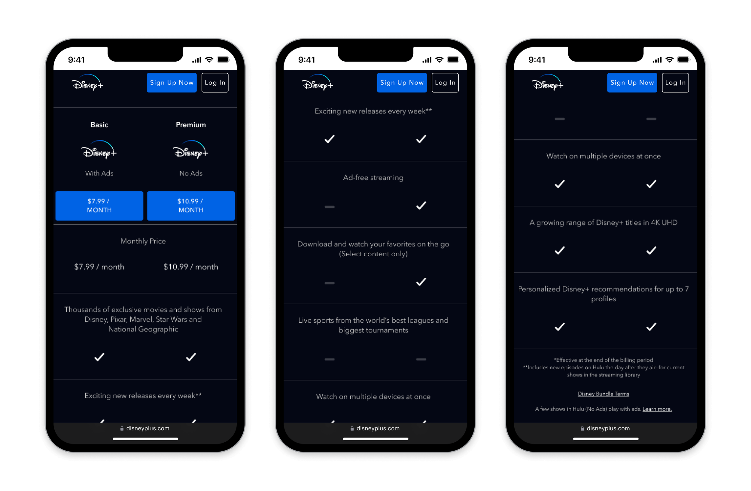
In 2022, we launched the Disney+ Plan Comparison Chart — a tool empowering prospective subscribers by spotlighting plan features, revealing details, and showcasing savings. Utilizing Cannonball 2.0 DS, our mobile-first design, seamless desktop integration, and user-friendly UI set the standard for comparing Bundle and stand-alone Disney+ plans.

Disney+ PCC — Mobile viewport, with and without sticky nav.

Disney+ PCC — Tablet viewport.

Disney+ PCC — Desktop viewport.
🧘🏻♀️ Flexible Options
Optimized for smaller screens, our chart ensures an intuitive touch experience on mobile and tablet devices. Sticky navigation allows users to focus, explore and compare plans easily.

☑️ Consistent Experience
Toggle between Duo Bundle, Trio Bundle and stand-alone Disney+ plans to explore options and choose what suits your preferences and budget.
As a responsive page, our chart scales seamlessly to desktop and takes advantage of the bigger viewport.
Gallery
Explore our Disney+ Plan Comparison Chart today and see how we helped Disney+ gain millions of subscribers.
Client
Disney Streaming Services
Year
Summer 2022

Disney+ Plan Comparison Chart
-
Develop a streamlined and comprehensive Plan Comparison Chart for Disney+, balancing efficiency with simplicity.
As a responsive web module, the chart must maintain consistency in design, user experience, and aesthetics across both mobile and desktop platforms.
-
The Disney+ Plan Comparison Chart achieved remarkable success, with A/B/C testing yielding the following results:
• A 3.4% increase in the overall conversion rate was observed.
• The results are anticipated to drive an additional +31K subscribers and $4M in incremental revenue within a year.
• The Disney+ Comparison Chart Module is expected to generate a 4.2% uplift in the 10-year Lifetime Value (LTV).
-
Thanh Le — UI Designer, UX Designer, Web Designer, Visual Designer
Devanté Carpenter — Product Designer
Darren Weik — Product Designer
Asma Mian — Product Design Manager
Adam Mignanelli — Design Director